One step ahead
GEFA Preven has been providing occupational risk prevention services for more than 20 years. The company, which was founded in Tortosa, currently has 15 offices across different communities and provides services to thousands of clients.
While continuing to offer local services closely linked to each region, it has diversified its services to cover other regulatory matters for companies. GEFA has pursued a bold growth strategy supported by an expert and experienced team.


Challenge
GEFA Preven wanted to undertake an expansion strategy to become a medium-sized operator in the sector at a national level. It was important to ensure consistency throughout the growth process, and we also had to bring on new teams and establish the brand in the market. GEFA Preven wanted to diversify its services as well as reach wider target audiences with a bigger variety of needs.
The solution
The first step was to organise the company portfolio and define key aspects of the brand to represent GEFA’s differentiating factors. The new identity had to uphold its position in the market and help gain the trust of new customers.
After a period of research in which we did internal interviews, customer interviews and analysis of the market and competition, we identified different audiences with varying degrees of maturity in the sector. These different levels began with smaller customers struggling with navigating compliance around mandatory regulations, followed by functional and digital evaluations of companies, to fostering and enhancing preventative cultures within larger organisations.
We decided to take this message of remembering and preventing one step further, aligning the brand with a culture of risk prevention. Even developing the brand’s own identity of prevention.

Arquitecture
One of the conclusions of the initial diagnosis was to propose a brand architecture under which to organize Gefa’s activity.
The founding brand, Gefa Preven, concentrated most of the commercial activity but there was another business unit that was gaining strength that was named after its main service and they wanted to launch another independent activity in the medium term.
It was necessary to create a brand system to differentiate the group’s business units and do so with a long view so that these brands allowed the organization to grow.
The conclusion was to create a three-brand system. GEFA Preven, the brand under which the majority of business operated, had to make room in the medium term for two sub-brands: GEFA Compliance and GEFA Learning We also reorganised the portfolio of services to better handle future growth.
Strategy
If there is one phrase that could encapsulate the brand strategy, it would be “Back to basics”.
The key was to go back to basics and make sure every step was done right. We translated this as “going one step further”. We also highlighted the values of expertise and commitment that underpinned GEFA’s purpose as an organisation.
Based on an insight from our research that people desired peace of mind of being able to count on GEFEN when needed, no fuss, a brand purpose was born: to make prevention simple.
Visual
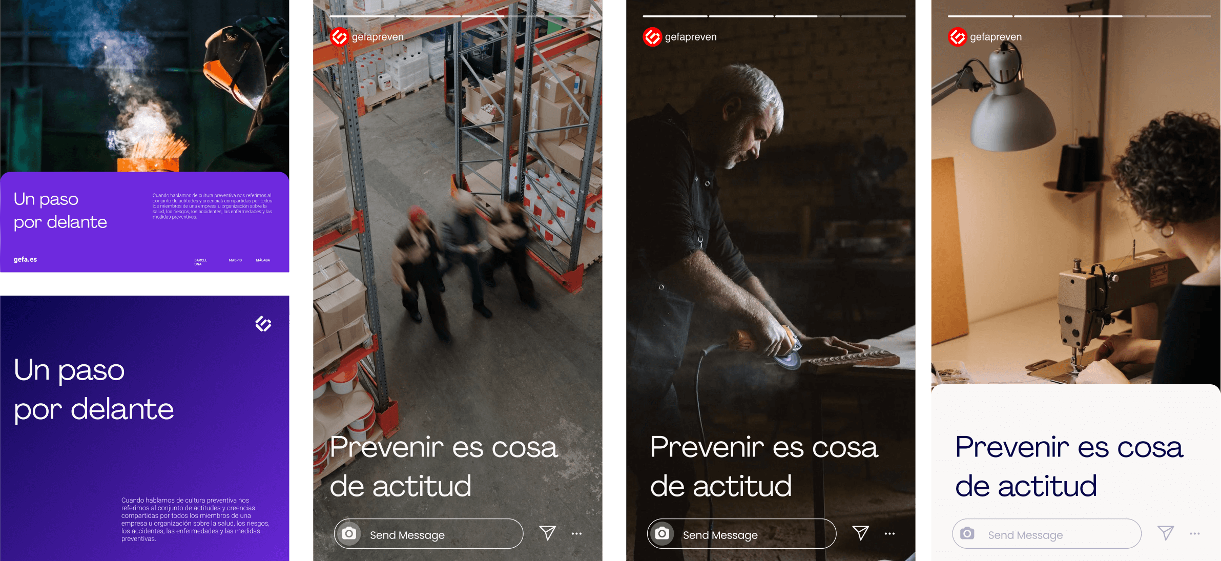
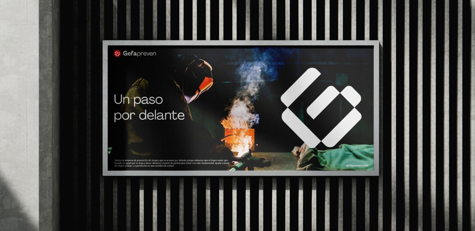
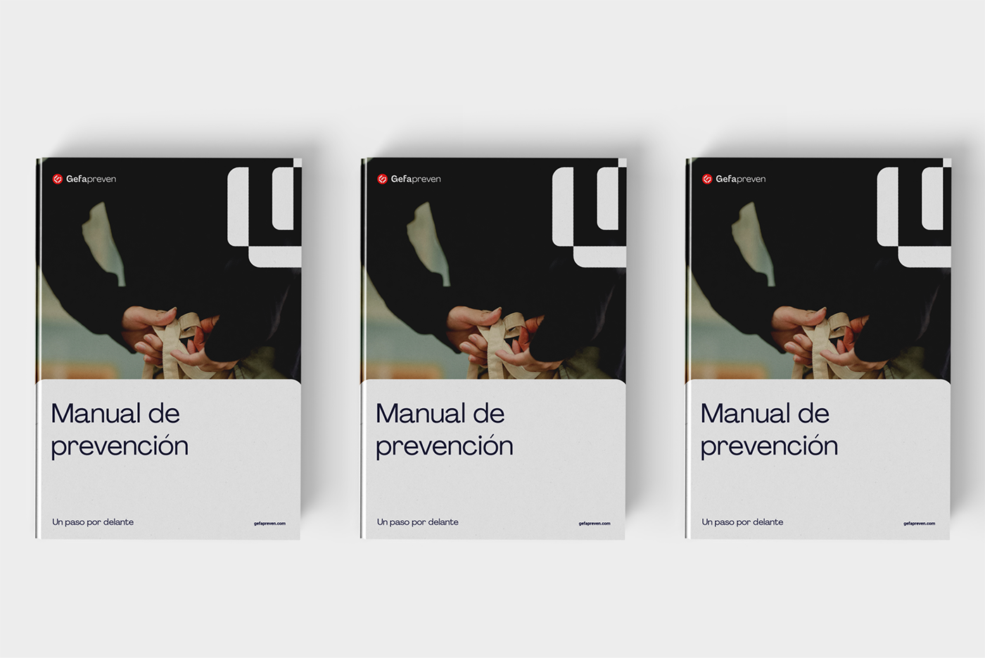
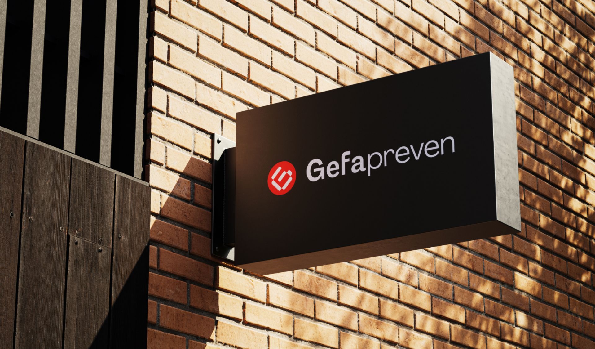
En cuanto a la identidad visual desarrollamos un sistema gráfico flexible y minimalista diseñado para perdurar en el tiempo. Nos distanciamos de los códigos visuales convencionales en el sector de la prevención, aspirando a fusionar un estilo contemporáneo con la solidez de un grupo experto.
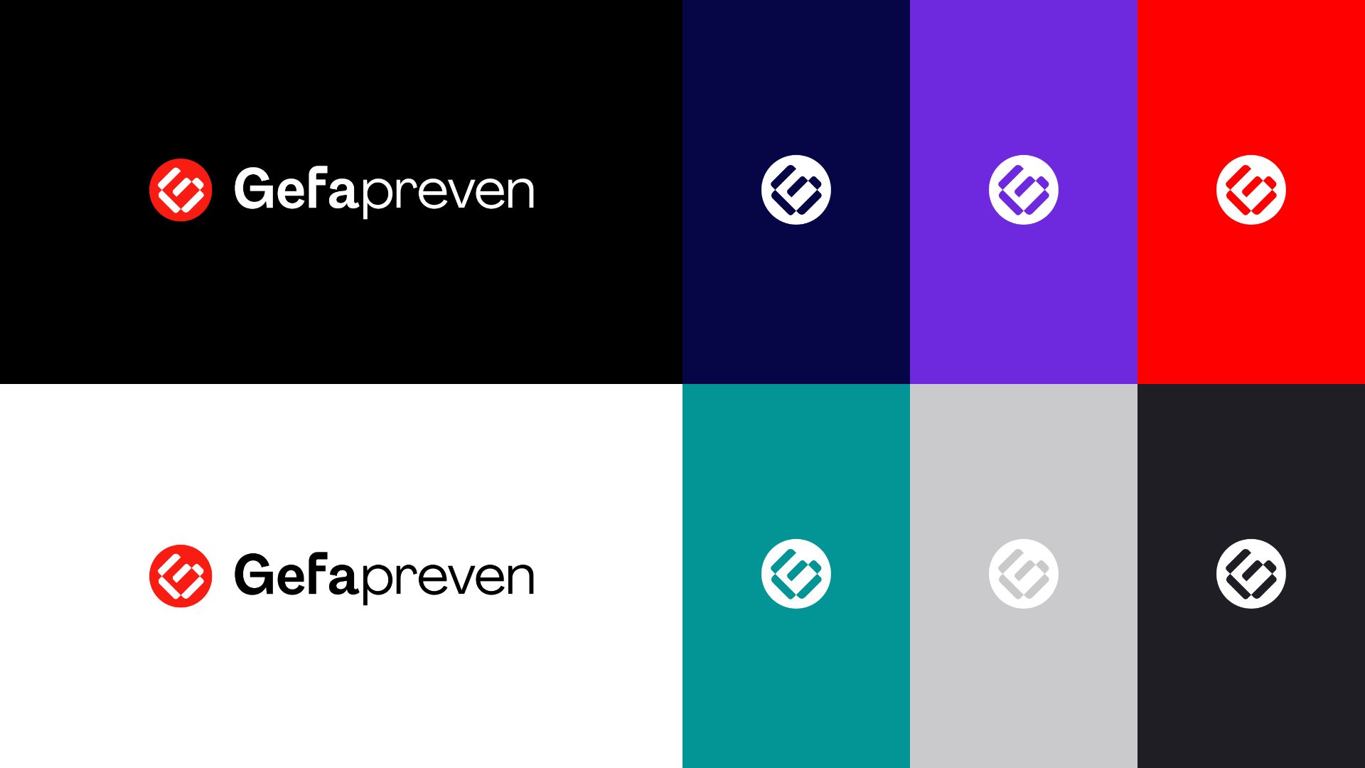
El punto rojo de la identidad visual es una llamada de atención sutil. El color rojo solo se utiliza en el símbolo para transmitir que GEFA está siempre protegiendo, como un faro, para salvaguardar la protección de las organizaciones.
El sistema gráfico desarrollado es flexible. La gama de colores contempla los formatos digitales con colores más brillantes y atrevidos. El símbolo G de GEFA se plantea como un elemento gráfico versátil y distintivo creado por unidades o módulos reflejando así el modus operandi de la organización.
Los elementos visuales se utilizan de manera coherente en todos los puntos de contacto de la marca. Garantizando una experiencia de marca cohesionada y reconocible para los clientes y grupos de interés de Gefa Preven.
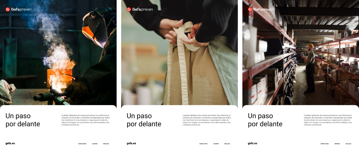
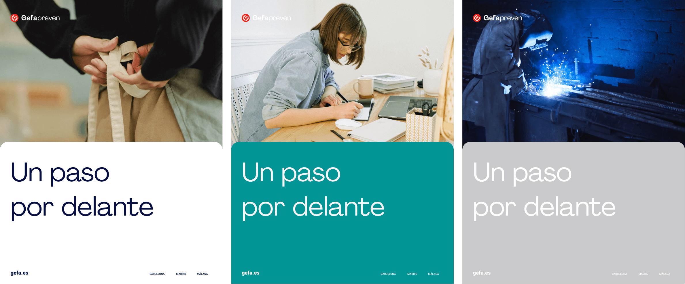
As for GEFA Preven’s visual identity, we developed a versatile and minimalist graphic identity that would stand the test of time. We moved away from conventional visual concepts in the prevention sector, seeking to combine trustworthy expertise with a modern look.
We added red dot to represent a subtle call for attention. GEFA Preven is always protecting, like a lighthouse, to safeguard the protection of organisations.
We developed an adaptable identity, with colour palettes that accommodate digital formats with brighter and bolder colours. The GEFA G symbol is also a very versatile and distinctive point of focus
The visual elements are used consistently across all brand touch points, ensuring a cohesive and recognisable brand experience for GEFA Preven’s customers and stakeholders.