


The Power of Simplicity
D-GO is the electric drive systems brand for light vehicles created by DOGA, a leading European manufacturer. With D-GO, DOGA takes a bold step toward transforming urban mobility, using e-bikes as its launchpad.
D-GO offers drive systems that combine high performance with easy integration, designed to support the transition toward more sustainable mobility. Its solutions stand out for their reliability and for offering what e-bike and light vehicle manufacturers need most: power and accessibility in one system.


Challenge
DOGA is a seasoned manufacturer, well-known across various industrial sectors. With D-GO, it faces the challenge of entering a new market: electric drive systems for bicycles and light vehicles.
In this process, D-GO needs to connect with B2B2C audiences and build an aspirational brand with a strong narrative that allows for future growth, including new products and sub-brands. It also needs to define its relationship with DOGA to bring credibility while standing out in a competitive and unfamiliar landscape.
The challenge was to identify the real opportunity, craft a narrative aligned with DOGA’s industrial reputation, and build trust with both manufacturers and end users.
Approach
We started by thoroughly analyzing the e-bike and light vehicle market to find a realistic opportunity space for D-GO. We defined a brand that merges DOGA’s industrial strength with an aspirational tone, able to resonate with both manufacturers and consumers.
Through research that included internal interviews, competitive landscape analysis, and benchmarking within the sector, we identified a market heavily focused on technological innovation, particularly around motors. However, there was clear room for differentiation through reliability, seamless integration, and specialized technical support.
We chose to build the D-GO brand from a positioning that goes beyond selling electric drive systems. D-GO is positioned as a partner that combines DOGA’s proven track record with an entrepreneurial spirit — a brand that speaks about technology with authority, but in an approachable way.
Architecture and Naming
The naming process began by examining DOGA’s brand architecture and the business space the new spin-off would occupy. Among the proposed scenarios, we opted to create a new brand endorsed by DOGA.
The naming phase included legal checks and linguistic validation across multiple languages. We also organized a naming workshop to guide and objectify the decision-making process.
Strategy
“At D-GO, we’re experts in speaking simply.”
In a market filled with innovative brands and increasingly complex offerings, sometimes the best choice is the simplest one.
The key insight was: “We want a drive solution that is as powerful as it is accessible — one that enhances our e-bike design.”
D-GO positions itself as a partner for urban e-bike manufacturers who need a provider with a strong, well-executed, and customizable concept — without unnecessary complexity.
Identity
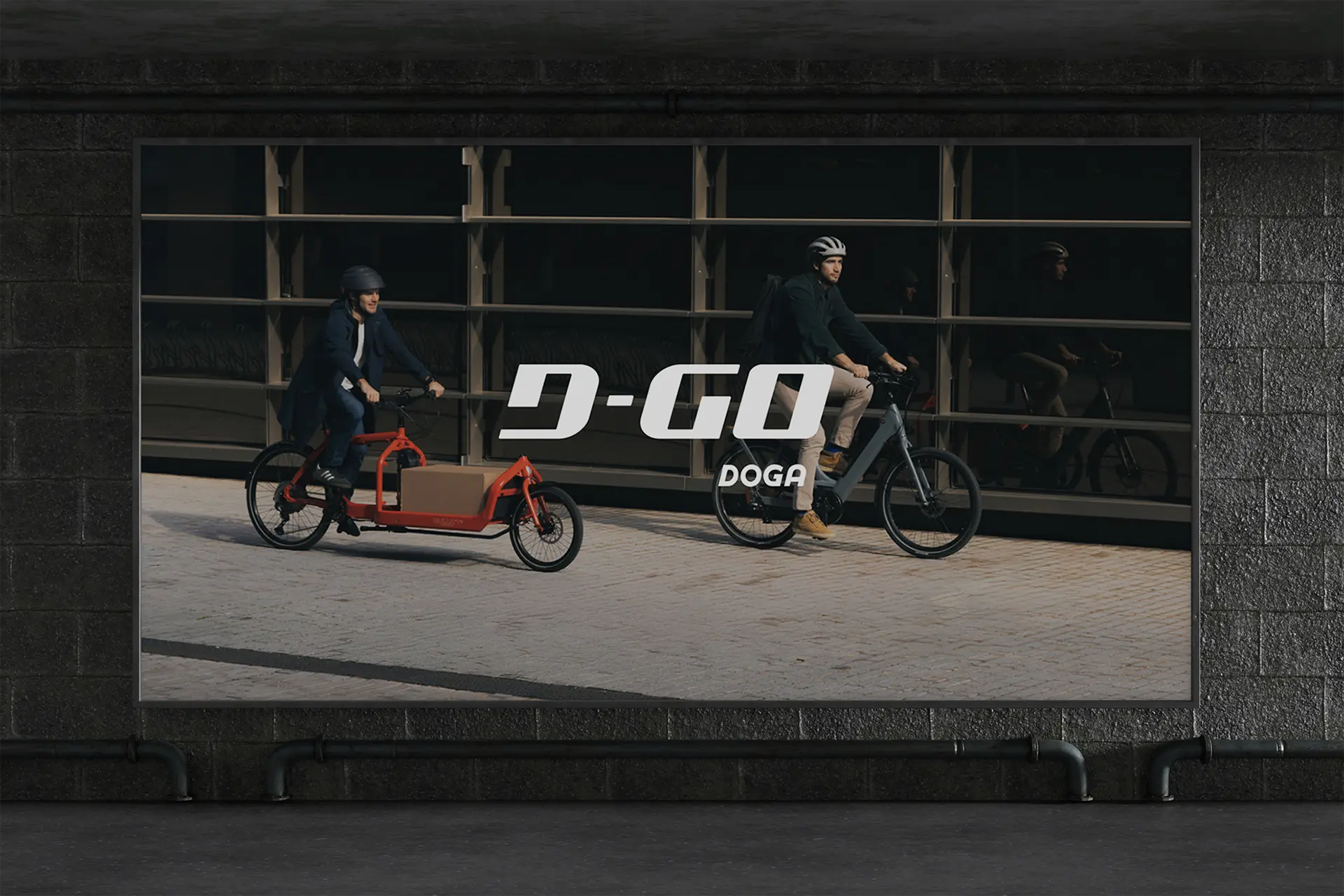
The D-GO DOGA logo is a seal that conveys strength and accessibility in every line. Its curves and shapes express the advanced engineering behind the brand. The stylized, rounded forms of the “D” and “G” suggest movement and speed with elegant simplicity.
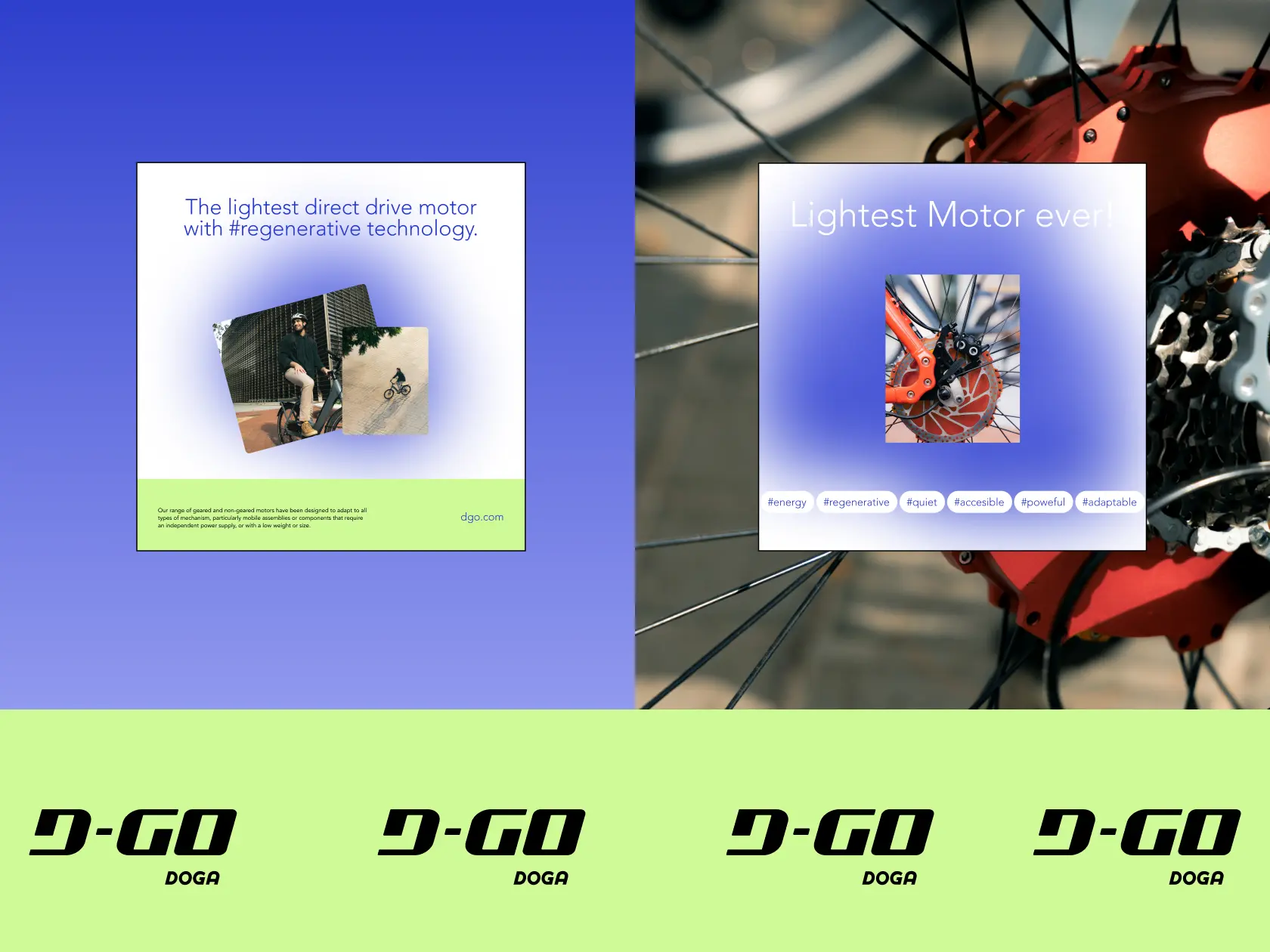
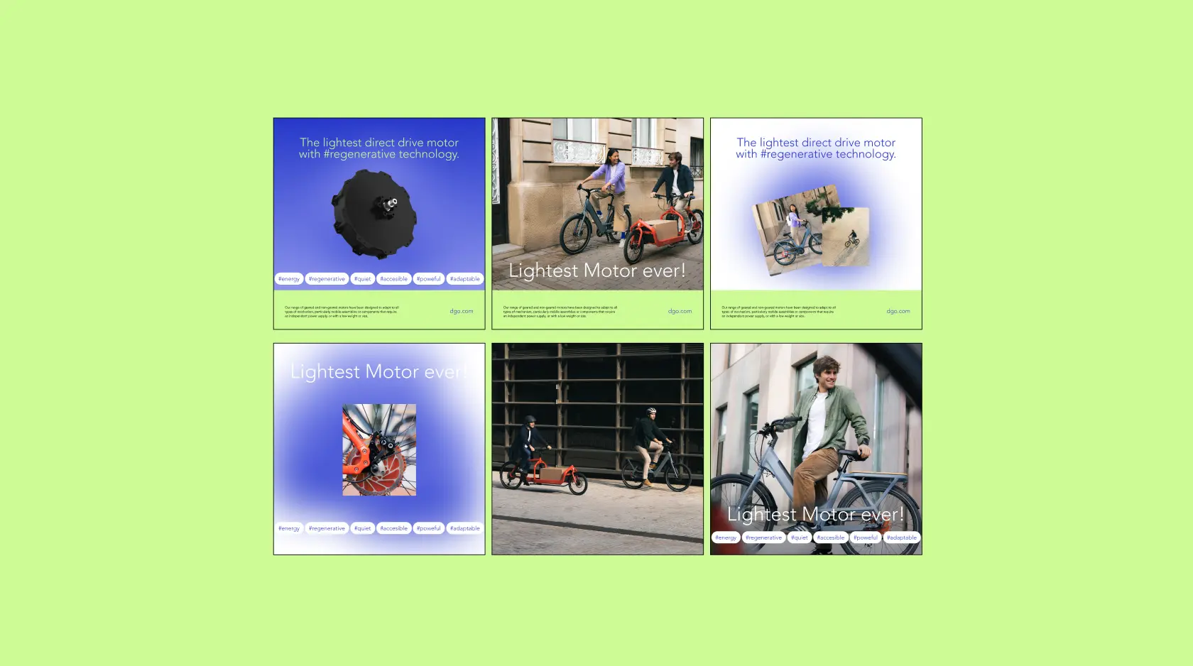
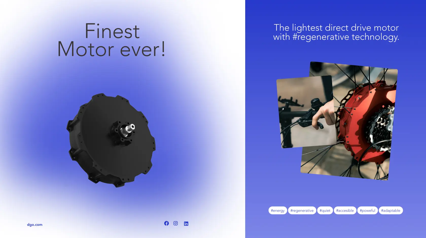
The visual system blends flexibility and energy. Vibrant colors, modular composition, and rich graphic elements allow the brand to adapt seamlessly to corporate, product experience, social media, or commercial settings.
The main typeface is Avenir — classic yet modern — which coexists with a coherent, adaptable visual system.
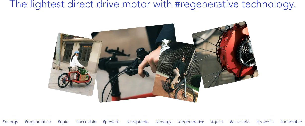
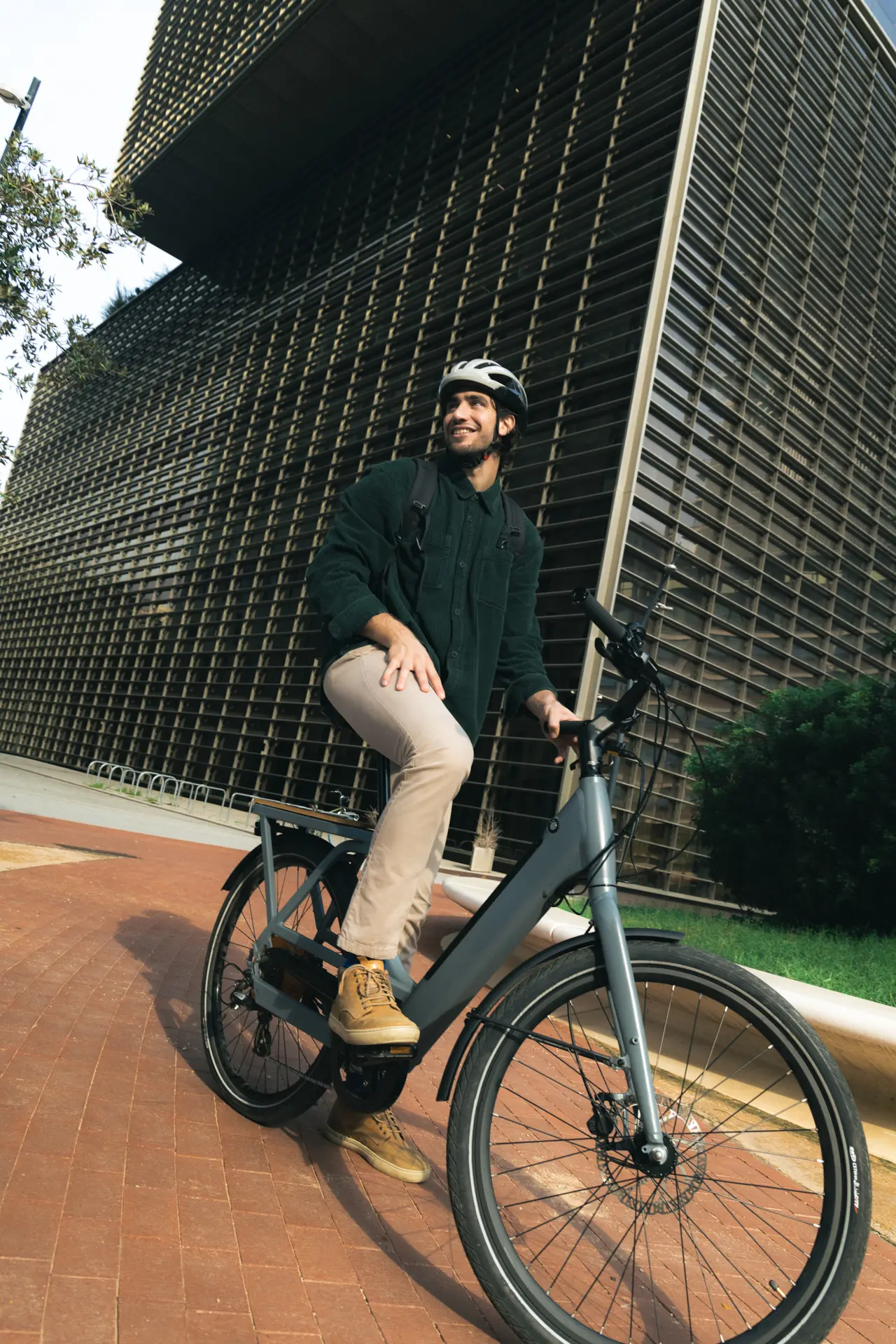
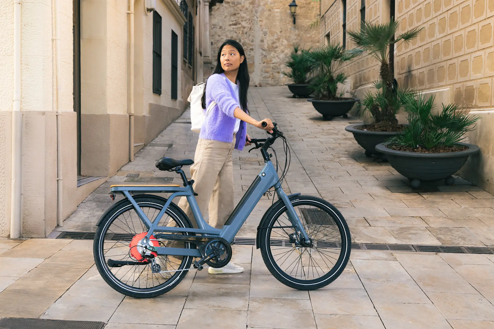
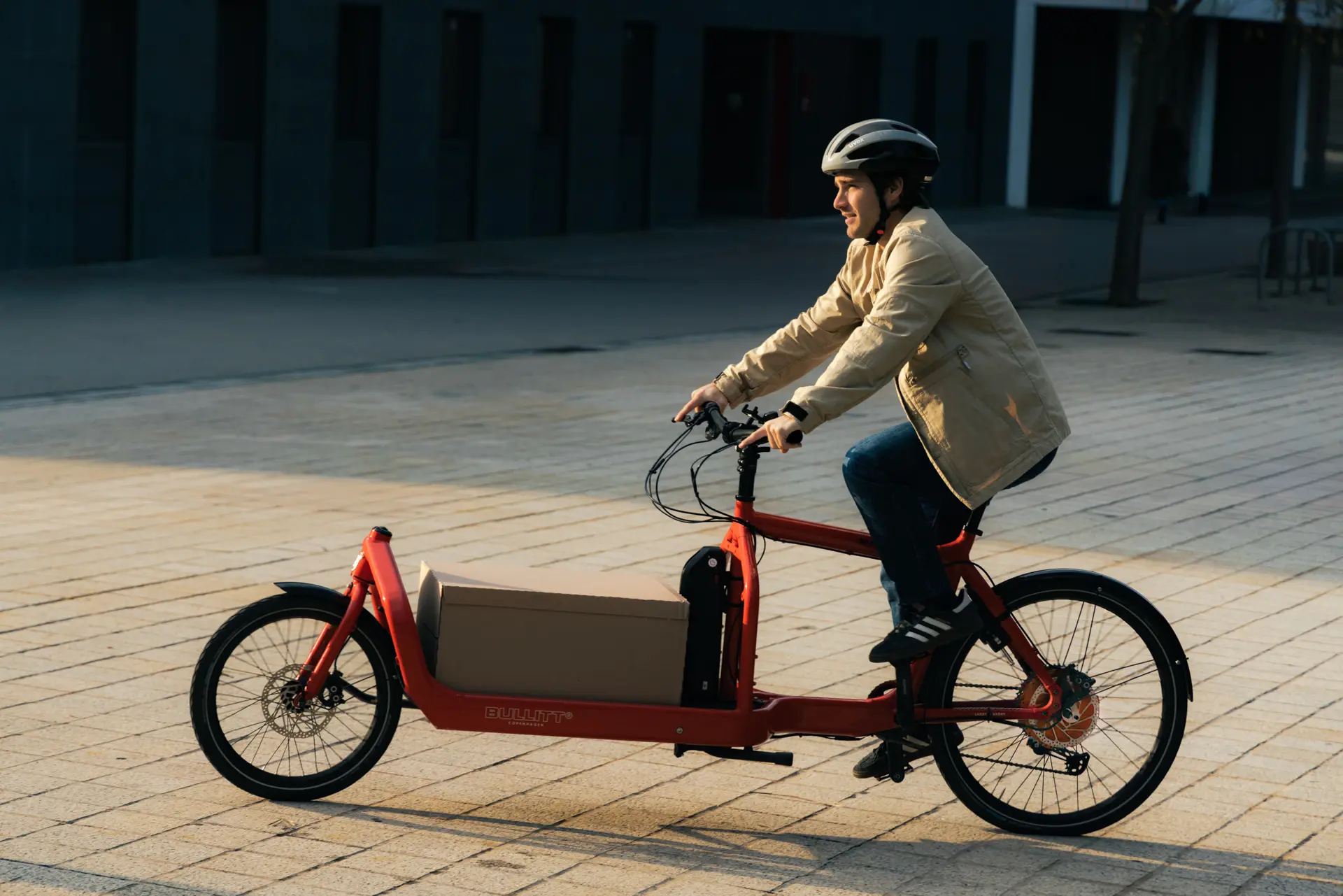
Staying true to the “Simple is better” territory, the imagery features clean, minimalist backgrounds. Morning lighting evokes calm, highlighting control and fluidity in every journey. Photos also aim to capture dynamism, reflecting the brand’s active, approachable personality.

Launch
The verbal identity expresses D-GO’s purpose: transforming urban mobility with clever, high-performance, and accessible technology.
The language reflects the simplicity and strength of its products, designed to integrate effortlessly into urban life.
We speak to both light electric vehicle manufacturers and end users, always in a tone that’s accessible, direct, and trustworthy. D-GO communicates with technical quality and shares knowledge clearly, using a style that inspires confidence.
The verbal guidelines define how the brand speaks — tone, style, preferred language, and guidance on pronoun use and multilingual adaptability.
Conclusion
D-GO builds a brand that translates DOGA’s industrial experience into the language of electric mobility, connecting with the e-bike market in a sector defined by innovation and competition in power and weight. A spin-off that projects autonomy without losing the support of its parent brand, backed by a clear narrative that combines advanced engineering with accessibility. In this way, D-GO positions itself as a trusted technology partner, ready to lead this new B2B2C market with simplicity, reliability, and future vision.